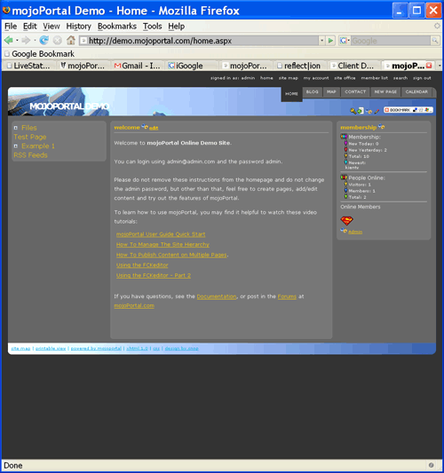
I've now completed 11 skins based on 8 designs of my 10 design campaign. The newest is snop-plasticboy-reflection, which can currently be seen on demo.mojoportal.com. Of course since its a public demo site, someone may come along and change it, but you can change it back or checkout the different skins by (key icon) Administration Menu > Site Settings.

A few of the designs I've made alternate versions of which accounts for 11 skins so far. I really only need 2 more designs to meet my original goal but I've decided to do 1 extra design. The 3 remaining designs will actually result in 6 more skins. These are the designs I've chosen to complete this skinning campaign:
styleshout-brightsideoflife
styleshout-citrusisland and styleshout-stylevantage (which I consider as variations on the same design)
styleshout-refresh, styleshout-envision, and styleshout-coolwater, which are all variations on the same design in my opinion.
Hopefully, I can complete all of these by sometime this weekend and then ship a new release with all these new skins.