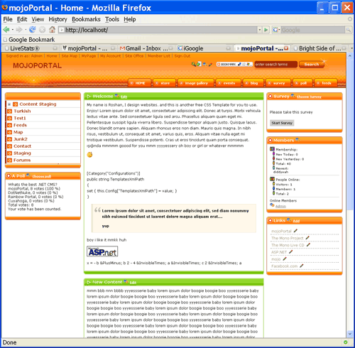
I just completed the first of ten new skins I plan to create for mojoPortal. This one is called graformix-company, you can see it now on demo.mojoportal.com, of course since this is a public demo site someone may come along and change it to a different skin, but you can always change it back by going into (key icon) Administration > Site Settings on the demo site.

This design took me 3 full days to fiinish, it was more challenging than some I've done. It required me to implement a few things to provide options in the rendering to make it possible, so it only works with the very latest svn code of mojoPortal. Specifically the tabs in the menu required 3 span elements inside the menu links to provide the hooks for hanging the background images that make up the tabs so I had to implement a custom menu rendering option to provide this. There are several different ways of implementing tab designs using marklup and css so this just adds one more method to our options which may prove helpful for other skins. This will be in svn trunk by tonight for eager developers and will be in the next release of mojoPortal for everyone else.
I am starting on the next skin now, its another one from Graformix, named graformix-orange.
In other news, a new custom News Feature by Asad Samarian is also available on the community download page. I have not tested it myself yet and it only supports MS SQL, but for any developers who would like to try it out and give Asad some feedback in the forums, please do. The .zip appears to contain the source code, so its not really packaged for non-developers.